
Film Frame Friday is a weekly series where one of our contributors will pick a film and highlight its unique cinematic style, from cinematography, mise-en-scene, editing to even sound. It is a great way to not only introduce someone to a new film but to bring new conversations to the table. Click here for more entries in the series.
The art of film editing is often, when done successfully, something that goes unnoticed. It’s a tool for filmmakers to stitch together entirely separate images, sometimes not even recorded in the same time or place, and fool the viewer’s eye and mind into thinking the actions they’re watching are temporally and spatially linked. If a character starts to stand up in a medium shot and the editor cuts to a wide half-way through the action, our brains fill in any missing or altered information so long as the action appears to match, even if the director and editor are cutting between take two of a scene and take fifty. We don’t even think about it; it’s like how our brains can read words whose letters are out of order so long as the first and last couple are where they should be.
Although this invisible style of editing, or continuity editing, was the gold standard of classic Hollywood cinema and is still used as the editing style of choice for most major films that come out to this day, it wasn’t always the case. During the silent era of film history, the Soviet film theory formalists (Sergei Eisenstein and Lev Kuleshov, most notably) bore down on the idea of montage—not montage as how we come to think of it in a post-Rocky world, but the entirety of how individual shots are sequenced in a film—as a way to create new meaning from separate images. One of the principals of montage theory is that viewers don’t interpret images one after the other in a string, despite viewing them in that order, but rather on top of one another, compounding their meaning. When thought of this way, editing isn’t a linear task, but an exercise in addition.
The Soviet filmmakers played extensively with all sorts of editing displays that called attention to themselves (rather than using the technique in the Hollywood manner of making it invisible so as not to distract the viewers from the actors) to create radical new ideas in a purely visual way. For example, in Eisenstein’s 1925 film Strike, he crosscut between striking workers being killed and real footage of cattle being slaughtered. Individually the two series of shots would be horrifying but insensate; taken together, the shots create allegory, an intangible and intellectual concept born from disparate images.
Kuleshov took this concept a step further and developed a theory that would become known as “The Kuleshov Effect.” He posited that the meaning of individual shots themselves is entirely derived from the images it is in sequence with. To demonstrate, here is an old man looking at some sky writing:

Sweet, right? He looks incredibly touched that his sky-writing sweeatheart has finally returned from the Bermuda Triangle and popped the question at the ripe old age of 82. Now, lets look at the same old man again, only this time he’s looking at something else:
Now it looks like he’s thinking he should probably get back inside. Images become alive through their context, and their meaning changes substantially depending on that context even though the image remains the same. The Kuleshov Effect is a demonstrative example of the power that film editing has on the work as a whole, and one that shows that even classical continuity editing has much more going on under the surface than one might realize. It wasn’t until New Hollywood arrived in the mid 1960’s that American films, inspired by a new wave of global cinematic revolutions that France kicked off, started exploring the potential of editing that calls attention to itself to create new meaning. Across the pond, Great Britain had already moved through its own brief new wave period, focusing on “kitchen sink” dramas around the grittiness of the working class, but through the 70’s major artistic works still managed to squeak out of a troubled studio system.
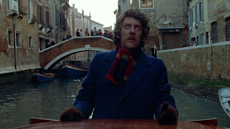
Enter 1973’s Don’t Look Now, directed by Nicolas Roeg and edited by Graeme Clifford, an adaptation of Daphne Du Maurier’s short story of the same name. It’s about a married couple, John (Donald Sutherland) and Laura Baxter (Julie Christie), who move to Venice, Italy to try to outrun their grief after their young daughter drowns in a pond by their home in England. The film is as much a portrait of how parents come to deal with such an immeasurable loss as it is a horror film (though its climax rightfully ends up on many “scariest moments in films” lists, I find it to be thoroughly chilling the whole way through despite a dearth of traditional scares). More germane to my point, however: Don’t Look Now is a sterling example of the crucial effect film editing can have beyond a mere timeline sequencer, and in this case it blends tenants of invisible editing with more attention-grabbing montage principals, not just as a function of telling a story but as a method that is core to the story itself, because the editing tricks used throughout are motivated by the characters within the story.
The whole picture is ripe with little moments that conjure unease, but there are three major editing set-pieces throughout the film: one in the opening, one in the middle, and one at the end that distinctly call attention to themselves. These three noteworthy sequences all happen at pivotal points in the narrative, and though I’m only going to be discussing the opening scene in substantial depth, there will be spoilers for the rest of the film, so if you have yet to watch this movie I highly encourage you to seek it out as soon as possible, as this is a movie where the form is predicated on the viewer being in the same state of unknowing as its protagonist. And if you have seen the movie, or you don’t give a damn about spoilers, I recommend you (re)watch the opening scene before we dive in.
Don’t Look Now‘s remarkable editing style appears at first as merely an enigmatic and haunting stylistic choice, but is eventually revealed to be a result of John’s miraculous ability to see premonitions of the future. Unfortunately for him, he is, like us, by turns unaware and then disbelieving of his gift, and as a result of incorrectly interpreting his visions he is led to his death in the form of a grotesque perversion of his daughter’s memory. In a montage (this time in the Rocky sense) during this climax, John witnesses in a flash many of the clues he misinterpreted or ignored along the way. The groundwork is laid from the beginning of the film, though, and if you watch Don’t Look Now for a second time you are able to catch just how much the film lays out clues and omens for John and the viewer to piece together before it’s too late.
Before the opening scene proper even begins, the film shows us rain pouring over a pond, which then cuts to sunlight filtering through a window of indiscernible origin while a man hums softly in the background. These images make no sense when you’re first exposed to them, but eventually we come to understand them as visions of the future, introducing the audience to the concept right away even when they don’t realize it yet. The film is never in your face about what it’s doing, despite constantly throwing presages of impending death on the screen.
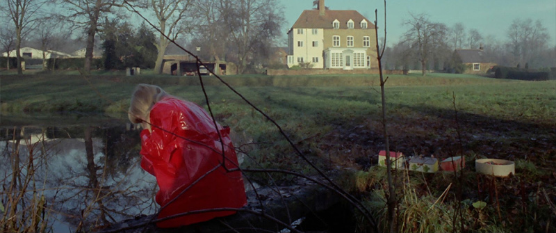
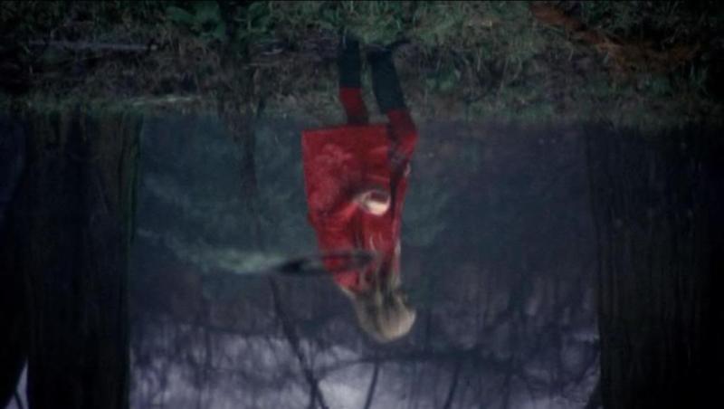
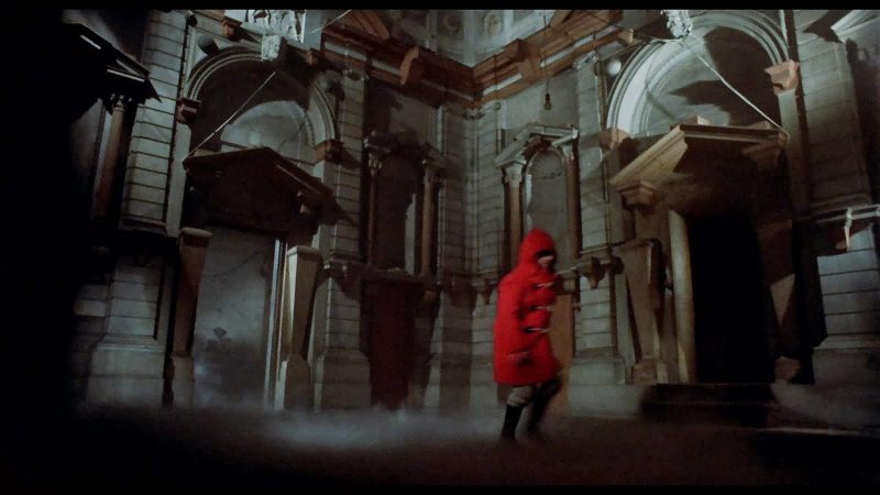
The first shot of the opening sequence in England already has a visual warning for the audience: in the background behind young Christine, clad in her bright red mac (which becomes an omen itself), a white horse runs across the frame. Those keen on their biblical allusions will know that a pale horse is what Death rides in the Book of Revelation (or if you’re just a big Twin Peaks fan you can connect the dots that way as well). The scene then begins inter-cutting between Christine playing with a soldier doll and getting ever so close to the pond in the family’s yard, and Johnny—John and Laura’s son—riding through fields on his bicycle. Eventually Christine reaches the pond and the camera zooms in on her inverted reflection within (a nice piece of visual foreshadowing already), before cutting to a close-up of a burning log and zooming back out to reveal we’re now inside the house. This edit uses both a graphic match (Christine’s red outfit and placement in the center of the frame is a mirror of the fire in the next shot) and a fluid match of the camera zooms in each respective shot to give the sensation that the two images are somehow physically linked. It’s a disconcerting moment, because it draws attention to itself in a seemingly confounding way, as viewers will want to make a mental connection whenever a graphic match is made (think of the famous bone-to-spaceship graphic match in 2001: A Space Odyssey and all the implications therein). The clues are there though because:
- Linking the watery image of Christine with the burning log is yet another harbinger of her impending death.
- This spacial linking is again a demonstration of John’s second sight. Notice how the camera zooms out past Laura, who is reading on the couch, and ends its zoom with John in the foreground, head turned towards the fireplace. This implies that John was looking through the fire, and seeing the image of Christine in the pond.
The cut that breaks us out of the Baxter’s living room and back out to the pond is another graphic match, again suggesting that the two images are somehow linked and that, by extension, John is able to sense that connection. The graphic match this time? John is looking at a slide of a church he’s restoring in Venice and he notices a childlike figure wearing the same red raincoat his daughter is wearing, leading of course to a cut to Christine, the camera still shooting only her reflection in the pond, suggesting a doom that has already trapped her.
From this point the cutting becomes even more suggestive yet more difficult to parse. As Christine’s reflection runs screen right and vanishes into the grass rimming the pond, we cut to Johnny riding his bicycle from screen right (where Christine disappeared) appearing from behind a tree, and riding towards screen left. The film cuts between the two as it looks like they are moving rapidly toward each other, before making an incredibly jarring graphic and aural match cut between Christine’s feet running through a puddle and Johnny’s bicycle tire smashing a pane of glass, and another cut of John—still inside—glancing up from his slide, looking disturbed. This all happens quite rapidly and hardly gives the viewer any time to think about the images they’re seeing, but because of the editing techniques used it ensures we know that somehow the three scenes are linked and are converging in a disquieting manner. And just as the color red, and water, become omens of death for the rest of the film, so too does the shattering of glass.
The next series of notable cuts: John is looking at Laura and as she puts her hand to her mouth, there is another match cut of Christine making the same gesture, and then as Laura is rummaging around for something as John watches, we cut again to reveal what it is she’s looking for: a cigarette left smoking on the lip of an ashtray in the kitchen. A smile comes to John’s face since he somehow knows what it is she’s looking for, and as he tosses her a pack we cut to Christine throwing a ball she picked up, and as it lands with a splash in the water we cut back to John knocking a glass of water onto the slide with the red figure, causing the colors to leak like a pool of blood, and it’s at this moment that John knows something terrible has happened.
By using invisible editing techniques like cutting on action and blending them with the principals of montage of creating new meaning from disparate images, Don’t Look Now is able to at once draw the audience into its unique visual logic and disturb them with disjunctive scenes that when taken as a whole provide a grim new understanding. The symbolism that the editing imbues in such motifs as the color red, water, and breaking glass, provides a layer of sophistication to the suspense and horror pervading the film that’s far more evocative than more blunt horror films that rely on scares built around the tactile physical senses.
The story of the film may be simple, but the editing conveys a visual layer of depth inherent to cinema (it’s very Hitchcockian in its approach to suspense, which is fitting since he also adapted two of Du Maurier’s stories into films of his own), as every image that Roeg and Clifford cut to is juxtaposed with the images that surround it and contextualized within the complex web of symbolism that is created within those juxtapositions. Suddenly every cut to a figure in red, a reflection, a body of water, becomes a specter haunted by the same grievous emotional wounds inflicted upon us in the opening that codifies the whole picture, and as such every close-up on Sutherland’s restrained performance becomes amplified by what we read into the images they’ve been paired up with (i.e., The Kuleshov Effect at work). One of those bravura editing set-pieces I mentioned earlier is a sex scene between John and Laura (presumably the first time they’ve had sex since the death of Christine) inter-cut with the couple separately getting ready to go out after the fact. Despite not saying a word, we are able to project emotional states onto their solitary rituals based on the juxtaposing shots of their love making.
Each of the three major editing sequences is concurrent with an intense emotional state for John. The death of his daughter is grief, the sex with his wife is passion, and finally his own death is one of horror. Throughout the entire film we are made uneasy through the editing, but, if you’re like John, you will still have misread the warning signs and belied your vague sense of disquiet with a yearning for him to be reunited with what appears to be his daughter running alongside the watery canals of Venice. Shocking in both its perversity, and as an apparent non-sequitur, the child turns out not to be a child at all, but a wizened dwarf who grins at a shocked John before shaking her head knowingly and hacking his throat open with an immense knife. In his death throes we see all the clues we have missed, and the same images that took on one meaning earlier, be it the omen of his daughter’s death and the hope of her return, become re-contextualized as auguries of his own murder as they cut back to his distorted face, blood spilling from his neck in such a way that recalls the bleeding colors of the water-soaked slide from the beginning of the film.
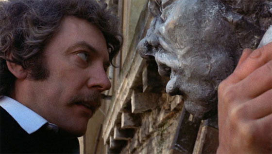
This sequence of the film is so scary for me because of how nakedly the film seems to be mocking both John and the viewer. The film plays no tricks with its editing; it doesn’t exactly spell things out but the answers are laid out well in advance (even the killer dwarf herself is foreshadowed beyond just the slide photo in the opening, as a series of serial killings plays out in the background of certain scenes, and even as a gargoyle John literally stares in the face). The smile and shaking of her head that the dwarf give before she kills John is her way of saying, “You were given everything you needed to survive this, but still you came to me. I’m not what you expected, am I?”
Back in the opening of the film, Laura asks John, “If the world’s round, why is a frozen pond flat?” before coming to the answer that indeed frozen water is slightly higher on one side than the other to which John responds, “Everything isn’t what it seems.”
Indeed.
Everything isn’t what it seems. That’s the power of editing.
